Engineers spend hours thinking about friction. Sometimes friction is bad. Chemical engineers review pipeline drawings to optimize paths through buildings by removing elbows or minimizing valves because they restrict flow. This decreases efficiency and increases cost. Mechanical engineers, on the other hand, might think about friction as a good thing if they’re trying to increase traction between a tire and the road for example.
Like engineers, EdTech product teams also need to think about friction. The long-predicted experience economy snapped into existence with the introduction of the iPhone. Early pinch and zoom gestures plus skeuomorphism helped us transition, and eventually gave way to flat interfaces with very efficient ways to get things done on small screens. It made all of us critical of the apps we install on these smart devices and of digital experiences in general. As a result, your users have become experience snobs.
User journeys through apps, software and websites must follow optimized paths with no confusion or distractions.
Sometimes friction is added on purpose — “Do you want to authorize this credit card?” — to make sure a user pauses before clicking buy. Unlike the engineer optimizing paths for inanimate liquids or making sure a tire grips on wet roads, the Edtech product team’s challenge is to improve experiences for real people who can choose to use a software tool or not, who can choose to rate an app with one star or five stars.
How do we manage friction and satisfy users? Avoid assumptions and discover what your users really want with diligent user experience mapping.
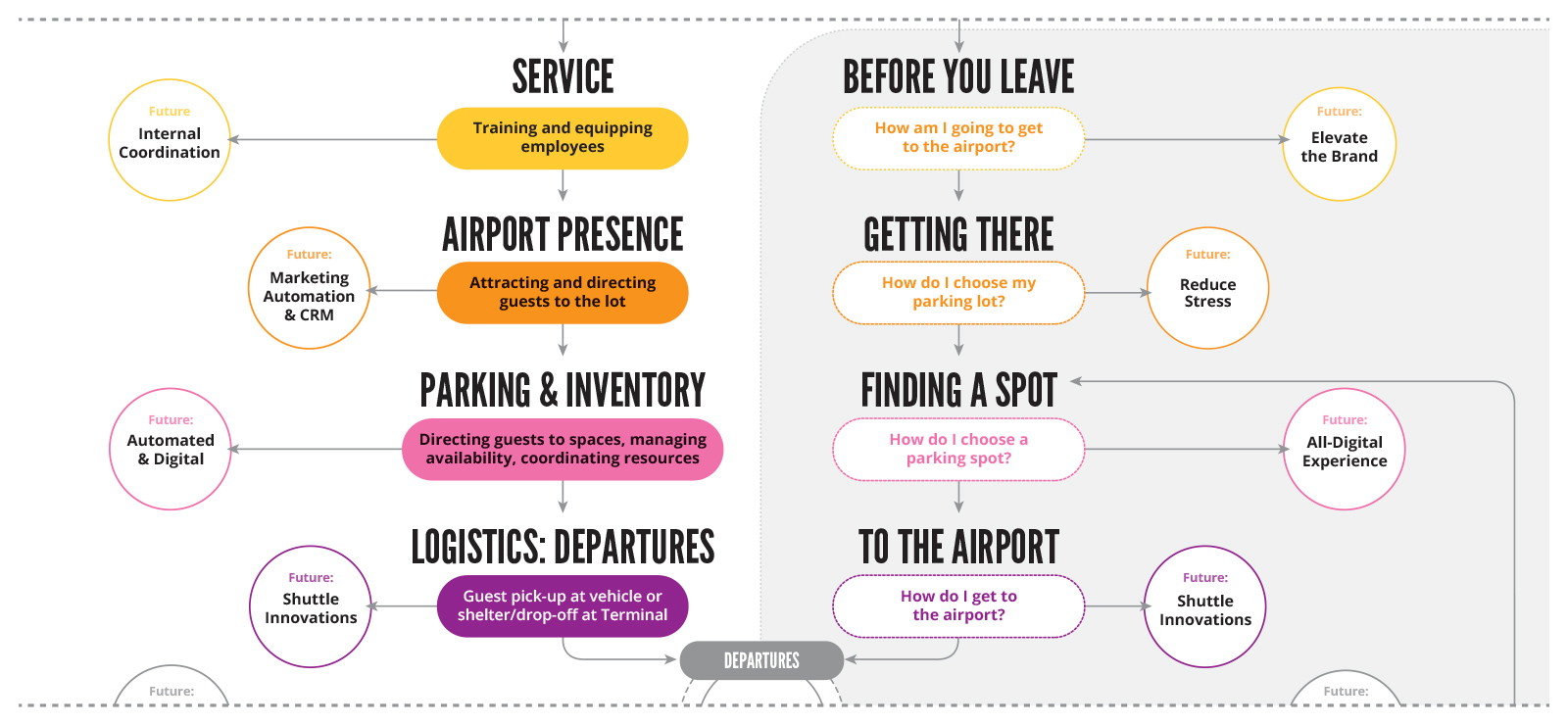
As part of a strategic process, we work with with users and key stakeholders to create experience maps that capture a holistic view of all of the touchpoints and interactions people have with, or related to a service or product. Mapping the journeys of students, instructors and administrators reveals issues and makes them actionable leading to opportunities to improve and innovate an experience.
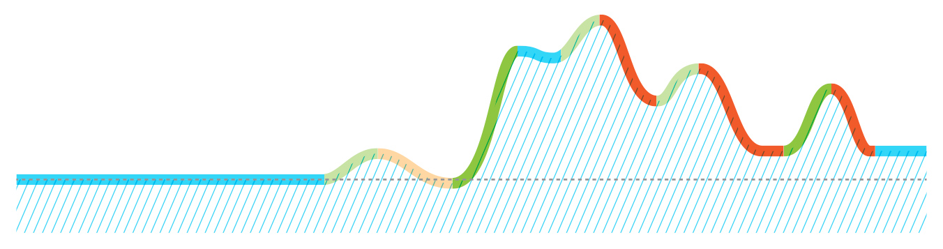
There are many components of an experience map. It is usually anchored by a timeline with a beginning, middle and end. It can also be a spectrum if there are multiple entry and exit points, or the experience is cyclic. On this spectrum or timeline, we plot activities or events. This can be something a user does like logging into student engagement tools, or an action that happens to them like being presented with a drop-down of options for course selections. This can become quite granular as all details are fleshed out.

At a higher scale, phases can also be identified by grouping activities together based on a user’s context, environmental conditions, or changes in the customer’s frame of mind. These phases could be associated with specific milestones like getting lab test results or represent a gradual progression through a system to make a reservation.
User input is critical.
Unlike engineers challenged with moving stuff, we’re dealing with humans who can think critically about the experience and make choices along the way. We need to consider and incorporate related information like demographics, traits, preferences, attitudes and underlying psychological motivations. Assumptions should be replaced with evidence-based insights. Gaps in understanding should be augmented with research that can include anything from online user surveys to focus groups to explorations of comparable experiences both inside and outside of the industry of focus. For example, EdTech can learn from what the travel or healthcare industries offer for solutions to similar challenges. Selecting courses or polling students should be as easy as making a reservation with an airline.
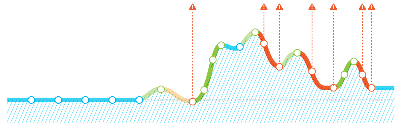
By interviewing students, instructors and administrators as part of the process, we can also plot relative highs and lows associated with their experience.
These can be physical or emotional attributes that rise and fall as they interact with your online service or progress through your loyalty sign-up process. Are they stressed or delighted? Do a disproportionate number abandon the experience at some point? Ideally pre- and post-optimization tests are conducted to validate the changes and continue fine-tuning the process.
As the experience map takes shape, we can identify specific touchpoints. These can be interactions with other related products, people, services or things. Very often these touchpoints represent unnecessary friction that can be minimized or removed entirely — “Why do I have to fill out the same paperwork every time I visit my Dr’s office?” Or opportunities to innovate — “let’s put a card in Apple Wallet that displays a QR code for a user’s parking reservation that can be read at the gate to gain entry to the lot.” There can even be opportunities to add positive friction. Gamifying an experience can reinforce learning, for example, but it must be used judiciously.
The end result is a richly detailed overview of the experience in question that reveals opportunities for improvement that can be prioritized based on cost/benefit for design and development.
In the short term, top priorities become the focus for a newly optimized experience, and secondary priorities inform the long-term roadmap for the product or service. This is why the most-used apps are constantly being updated. The tweaks can be subtle but, by continuing to balance positive and negative friction as we evolve the experience, users accrue incremental benefits frequently.
At Openfield, we know that awesome experiences are a must-have in today’s fast-changing educational environments.
Balancing positive and negative sources of friction, innovating opportunities and validating through user testing is a much better investment than plying users with costly and unsustainable incentives to overcome inefficiencies in the system. Conversion rates, engagement scores, social rankings and yes, revenue, are all measures that will show a positive response if the issues exposed with an experience map are systematically addressed.